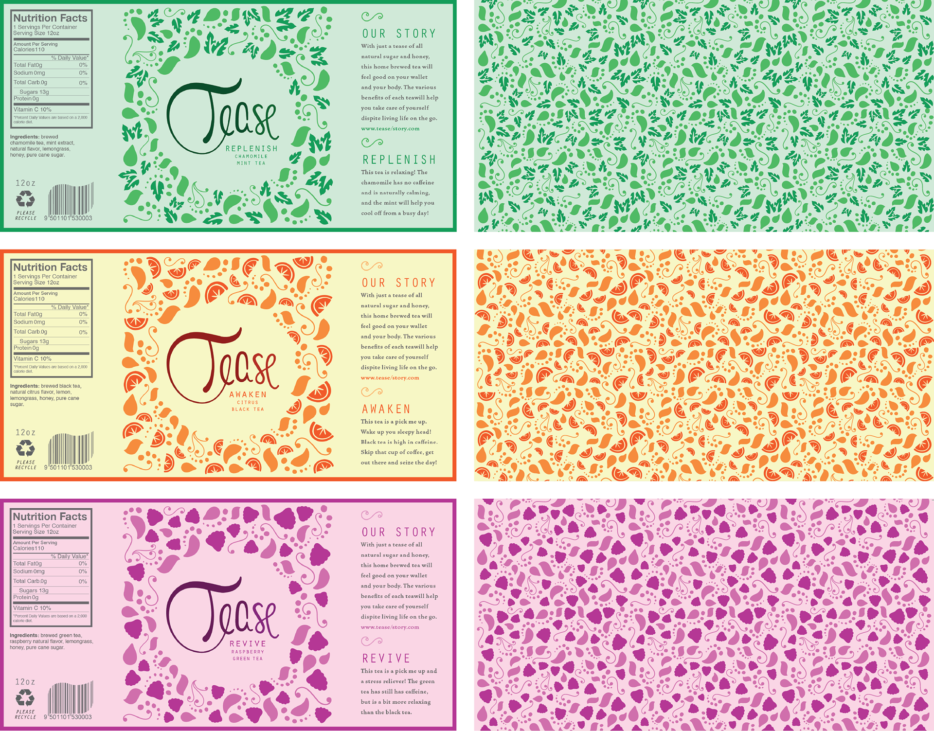
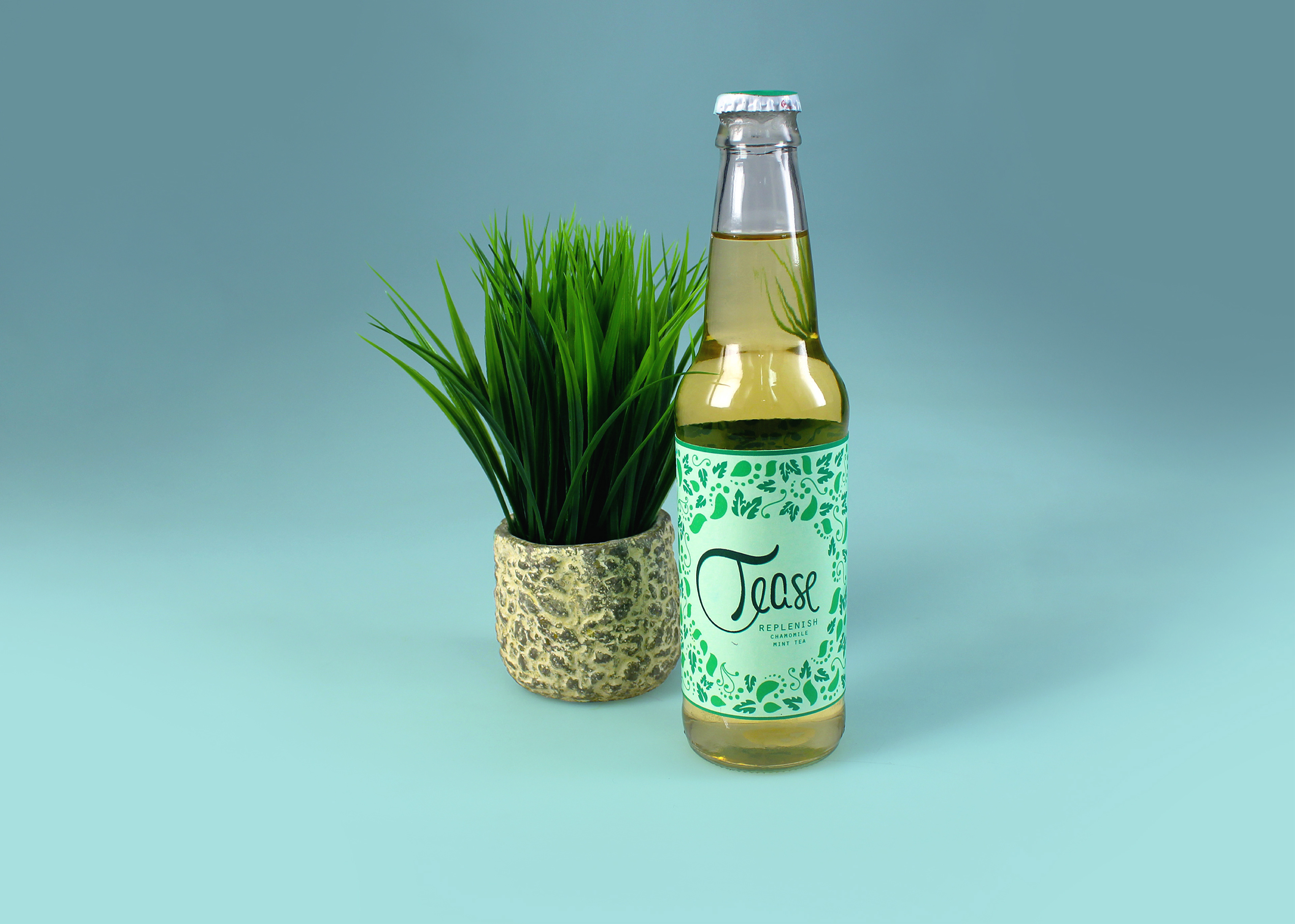
What is tease?
Tease is a brand of pre-made tea designed to offer a healthy, light option for mindful young adults. With minimal, all-natural ingredients, each tea boasts a hint of sweetness and a lot of flavor. Additionally, each flavor is crafted to provide specific benefits for both mind and body.
TARGET AUDIENCE
This tea is made for the on-the-go individual who still prioritizes taking care of their body. Loose leaf tea can be expensive and time-consuming, so "Tease" offers the benefits of real, home-brewed tea with the convenience and affordability of a gas station beverage.
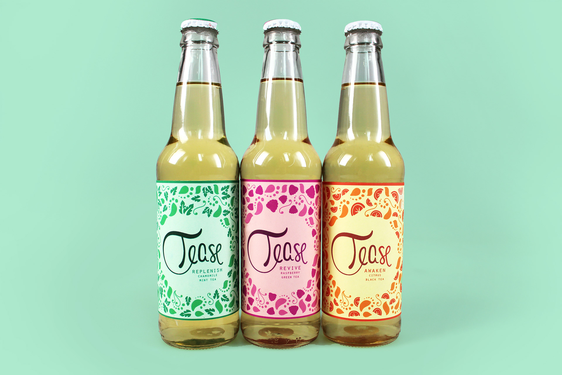
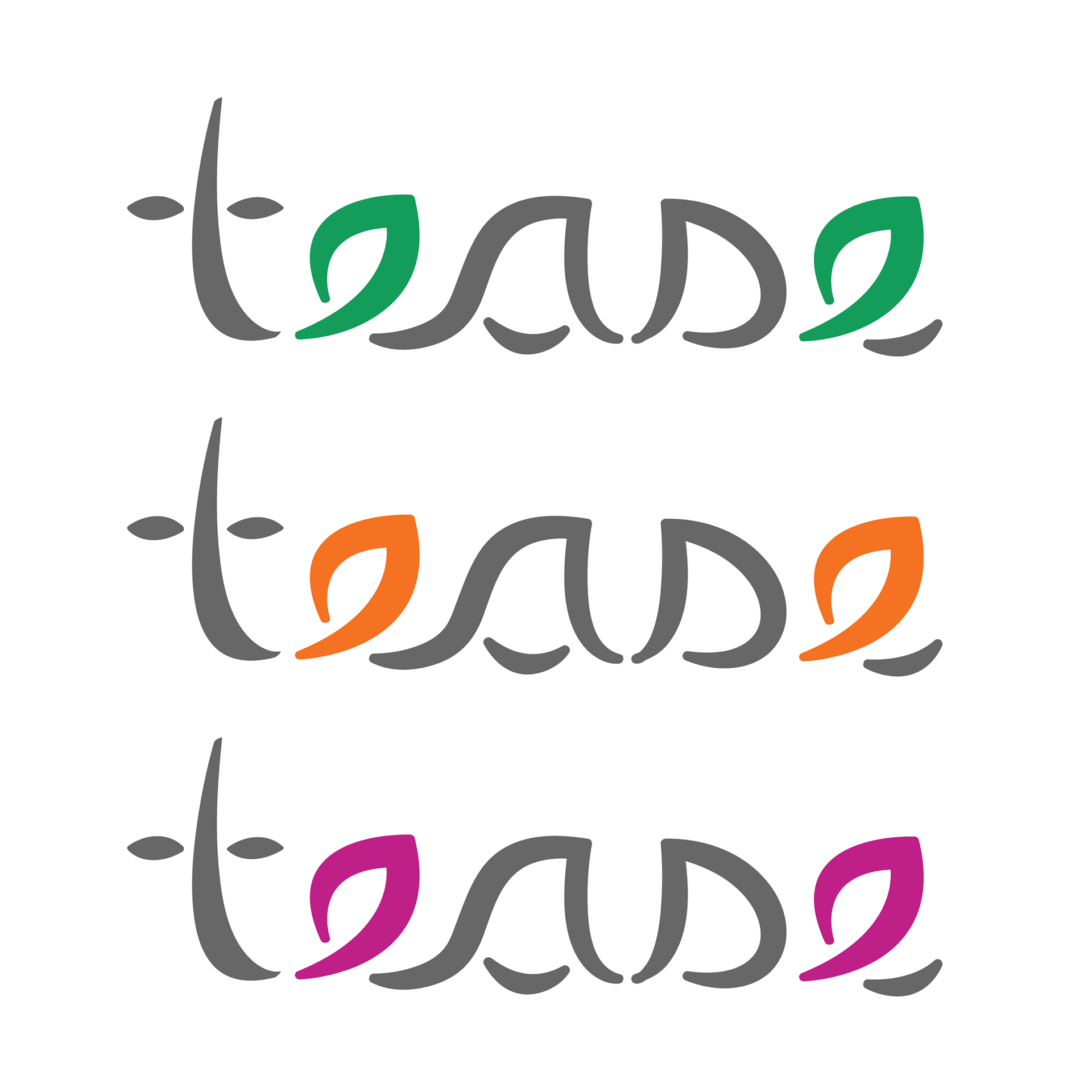
The logo and illustrations are all done by hand to give the tea an organic and playful feel. Tease is a brand that doesn't take themselves too seriously, and have a little fun.
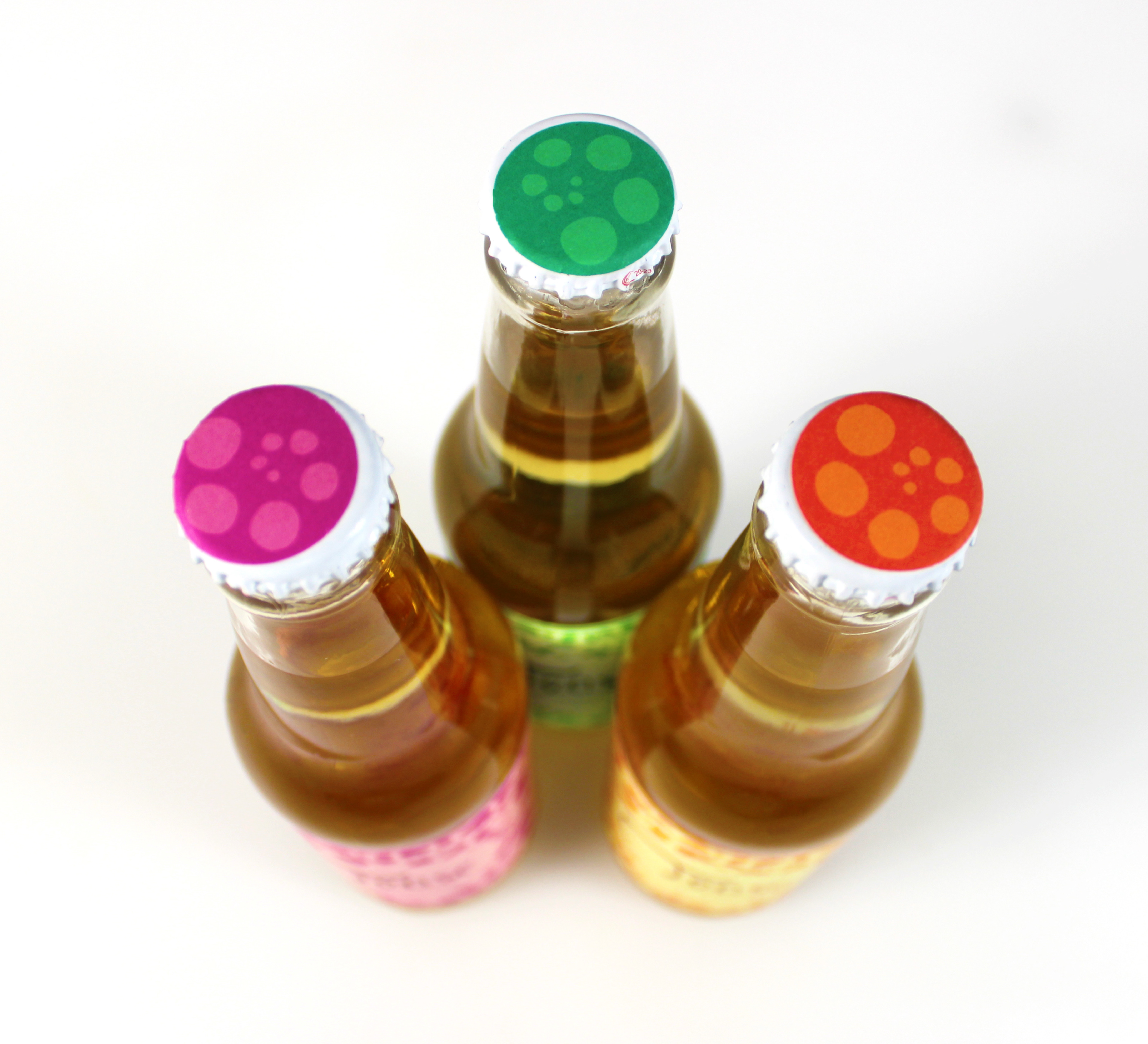
The logo and illustrations are all done by hand to give the tea an organic and playful feel. Tease is a brand that doesn't take themselves too seriously, and have a little fun.
Now... Do you want to see my process?
Initial Brainstorming
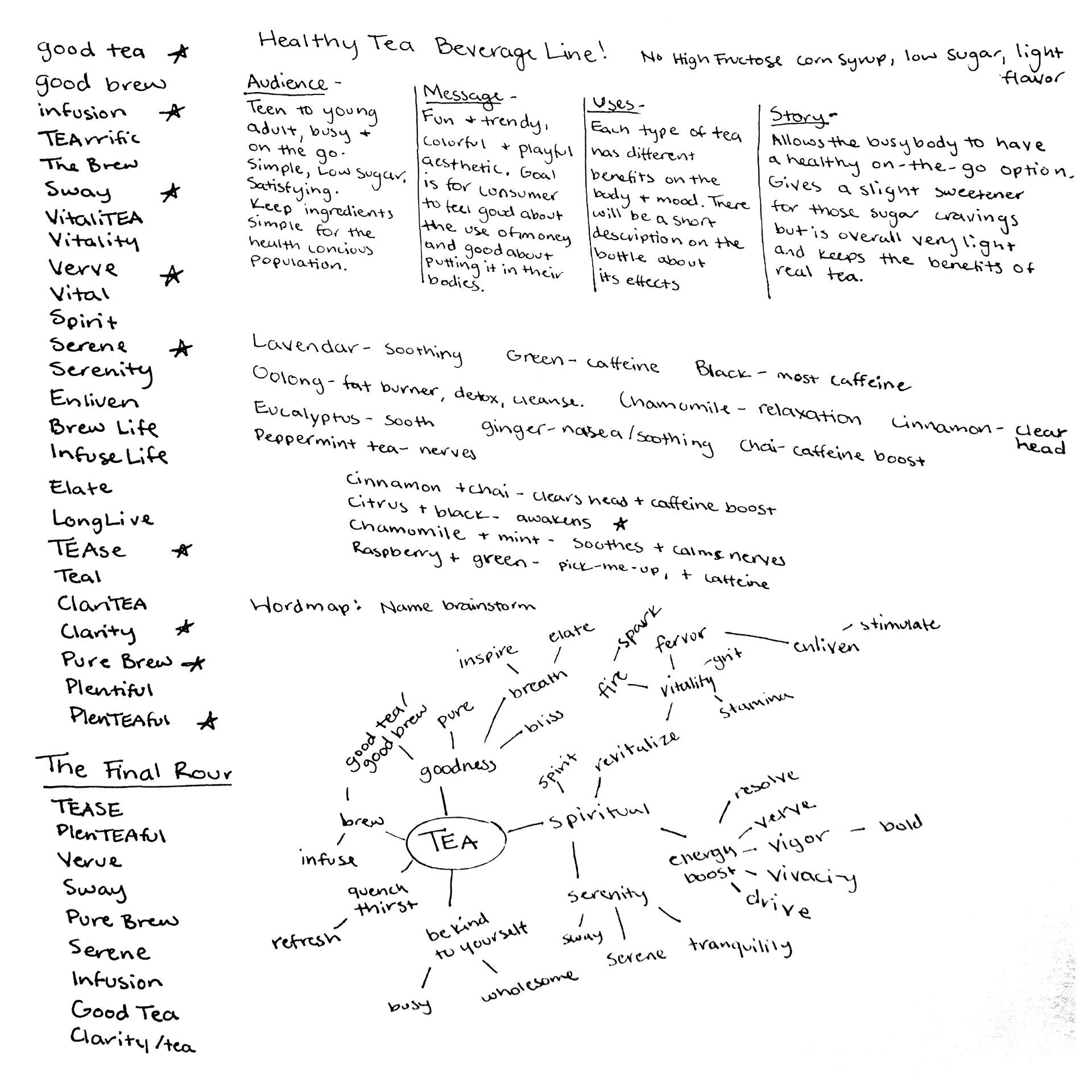
brainstorming
Before beginning to design, I try and get a handle of what it is I am trying to accomplish. I pin down what the key message of the company is and the key phrases associated with it.
The conclusions drawn here will inform the rest of the design work. The art is strategized to communicate a specific message to the targeted audience.
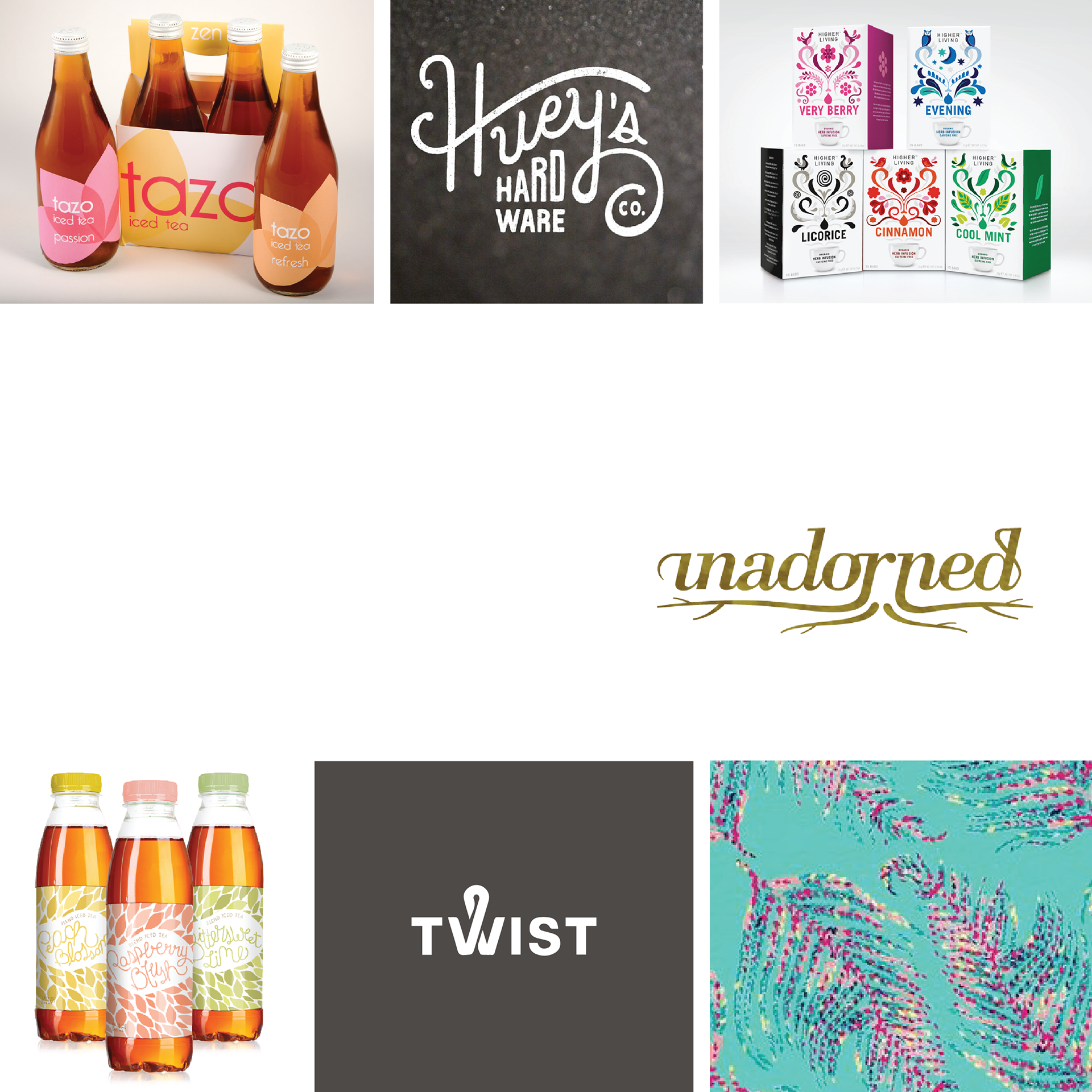
Inspiration Images
Next, I explore the visual market of what it is I am designing for. I found a collection of designs, logos, packaging, color, and type that identify from the brand identity.
I make multiple moodboards of possible directions, and then narrow down to the one that best matches the brand message. I keep in mind that this is a starting point only, and that the final draft should stand out from the rest on a shelf.
Visual Exploration
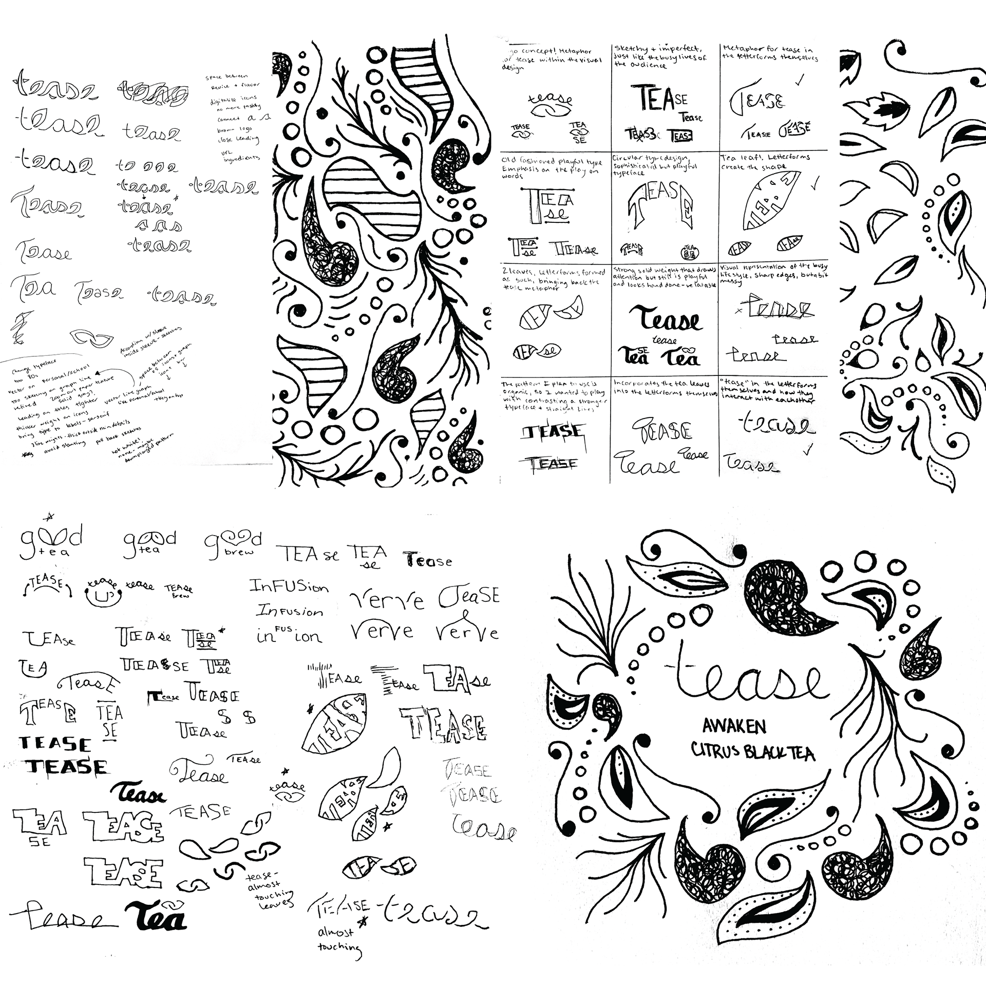
Sketches
I like to start the visual design by hand instead of digital. I start with quick sketches and move forward with the the best ones. I then play with variations of those and narrow down with more refined sketches before heading to the computer.
Digital Sketches
I brought my most successful sketches and expanded those into digital variations.
Revise and revise again
As I went through logo revisions, I started playing with my original sketches to see what worked and what didn't. I was trying to nail down the right combination of illustration style and typography, but it took some guess and check to get there.
The first round of revisions, I landed on this logo and color scheme.
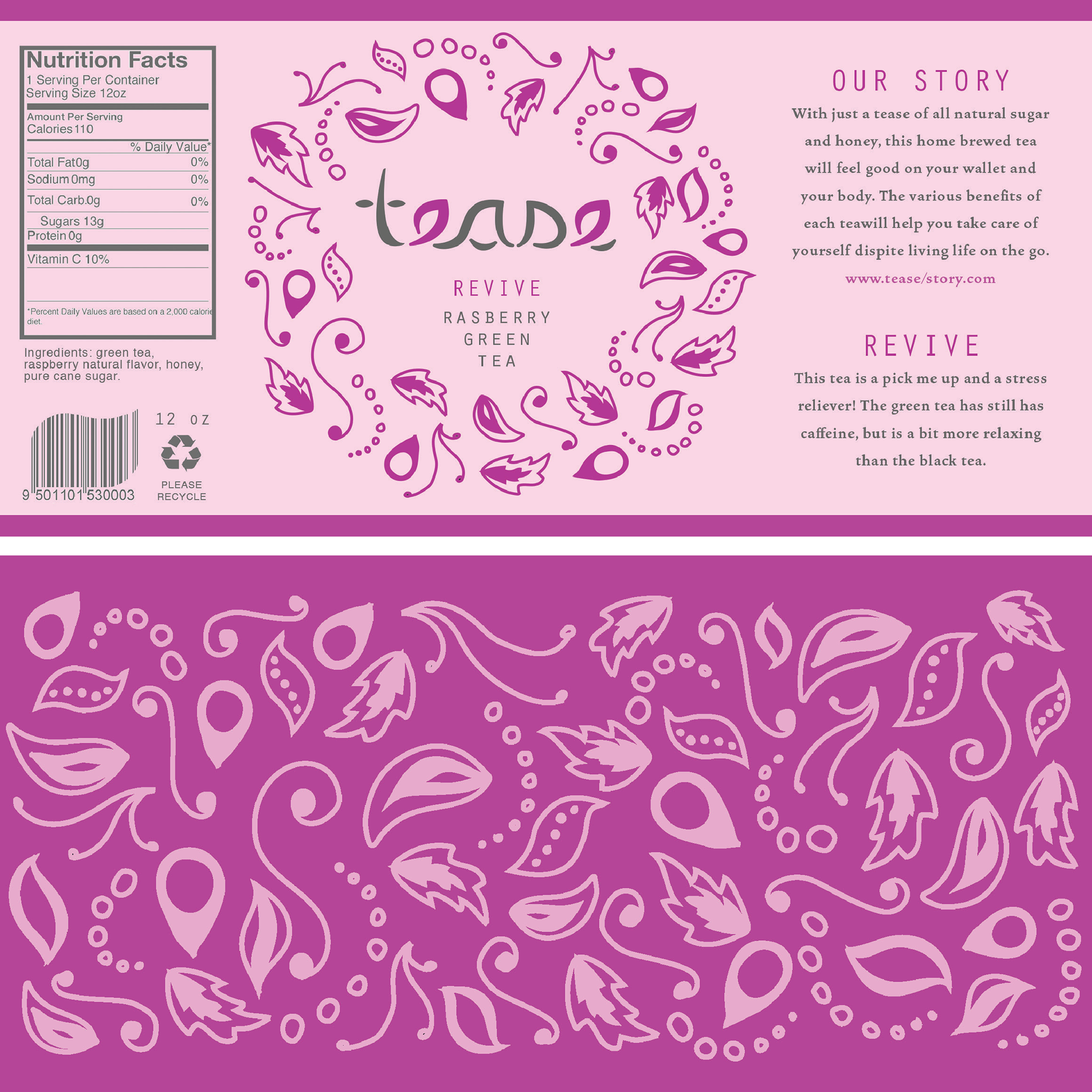
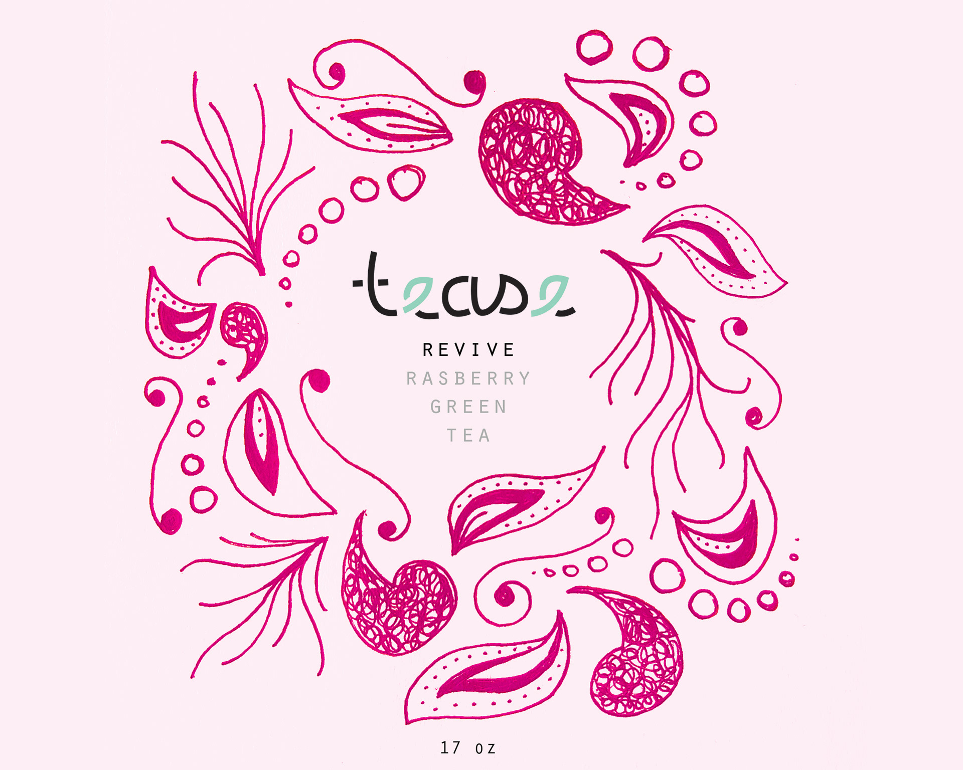
First Draft
My illustrations and type came together into my first complete label in three flavors. Though it was still a bit rough, I was able to print this and test it on the bottle itself, which helped me move forward in the right direction.
For instance, I learned that the pattern needed to be smaller on the inside because the liquid in the glass bottle magnified it.
Round Two
The creative process often moves in a circle. I went back to the beginning, reflecting back to my original moodboards. I also kept my first draft on hand so I could fix what wasn't working as I went. I went back to the sketchbook, and came up with a new, more legible logo.
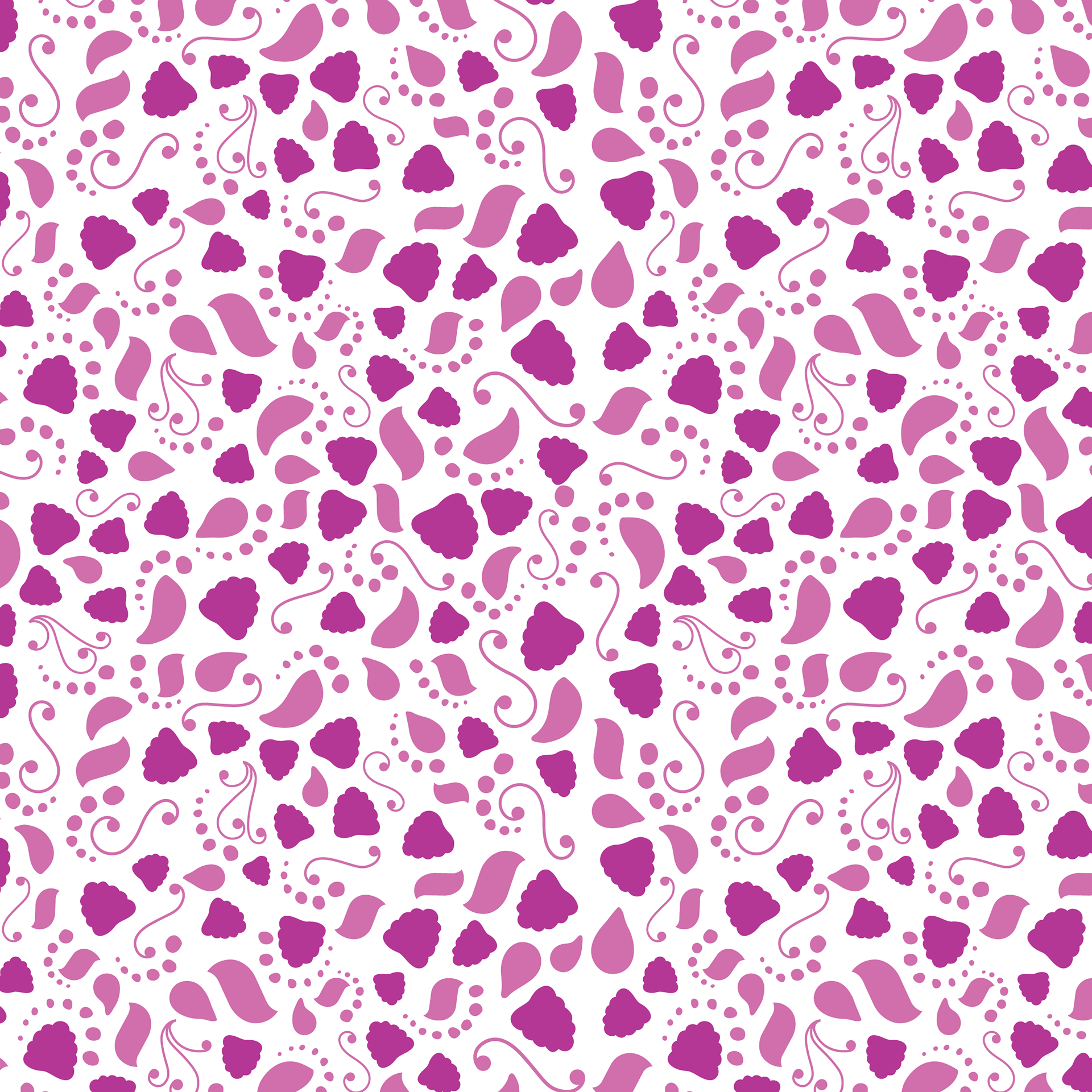
Patterns
I cleaned up the illustrations quite a bit, and made each pattern unique to the flavor of tea. The pattern is simplified and easier on the eye. This way it functions as more of a background element to the logo, creating an easier hierarchy and legibility.
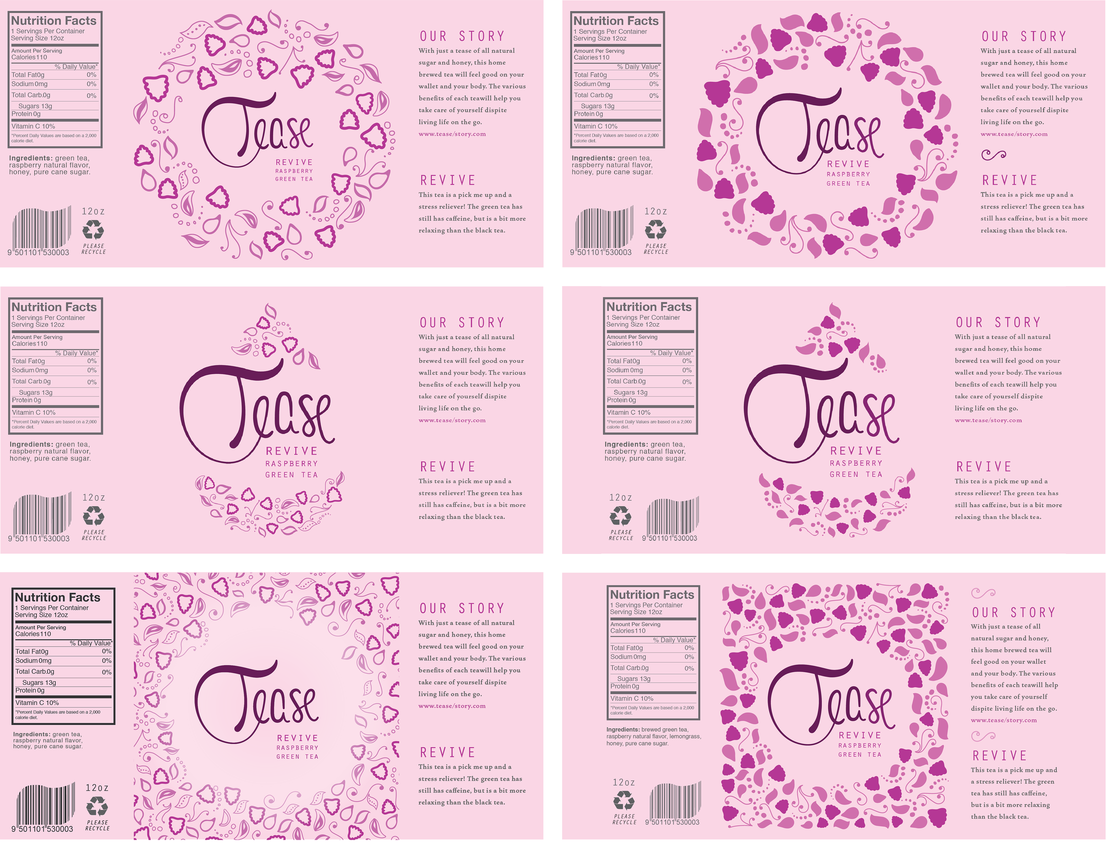
Variations
I then took the time to explore some alternatives to the set up the label, and these are the most successful of those.
Final Draft